Washington Commanders Rebrand Concept
The Redskins rebranded to the Commanders in 2022. However, the rebrand was met with deserved criticism for being “bland”, “generic”, “not fan-centric”, “disorganized”, and “absent of creativity”.
I’m a die-hard Washington fan, I wanted to envision what the Commander’s brand could look like with a bit more personality and character.
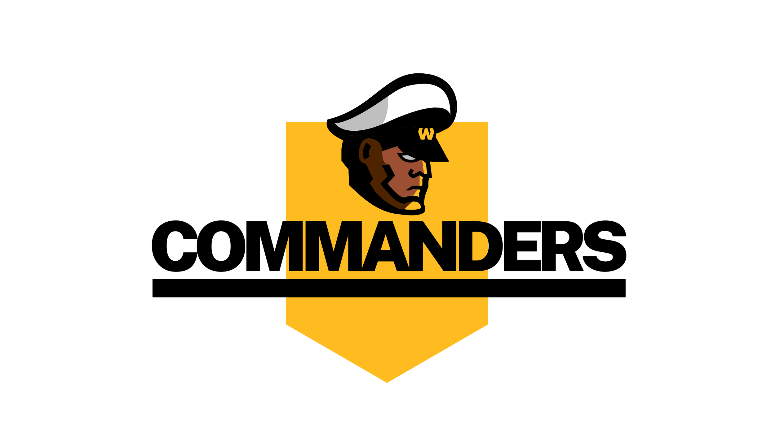
New Logo
Currently the logo is a very boring “W”. A logo should be representative of the team and it should create a mental model for the players to embody on the field. A stoic military commander, similar to the Patriot’s logo, is what I opted to go for.

Traditional Colors + New Colors
Keep the burgundy and gold, that’s core to DC’s football team. Add the Commander Green to tie it back to the military and DC. The pink ties back to the Hogs era of the 80s, 90s, as well as the cherry blossoms in DC.

Modernize the Uniforms
The gold and burgundy combination brings back the classic combo. The bold lines and numbers represent the stoutness that you want to embody on the football field.
Additionally there is an alternate, color rush uniform using the newly added colors: Commander Green and Hog Pink

Updated Font
Use public sans to represent the public — the people of DC.


