Sparkfund Brand Experience
Areas of Focus
The Problem
Video
Website
Product Branding
Conference
Presentations
Customers found that our communication was too dense, too academic, too word heavy. It was difficult for them to understand the value clearly.
We upgraded the brand to position Sparkfund to be a leader in the clean energy transition.
Old Branding Treatment - Monotone, Flat & Sterile

New Branding Treatment - Vibrant, Energetic & Dynamic

Brand Elements
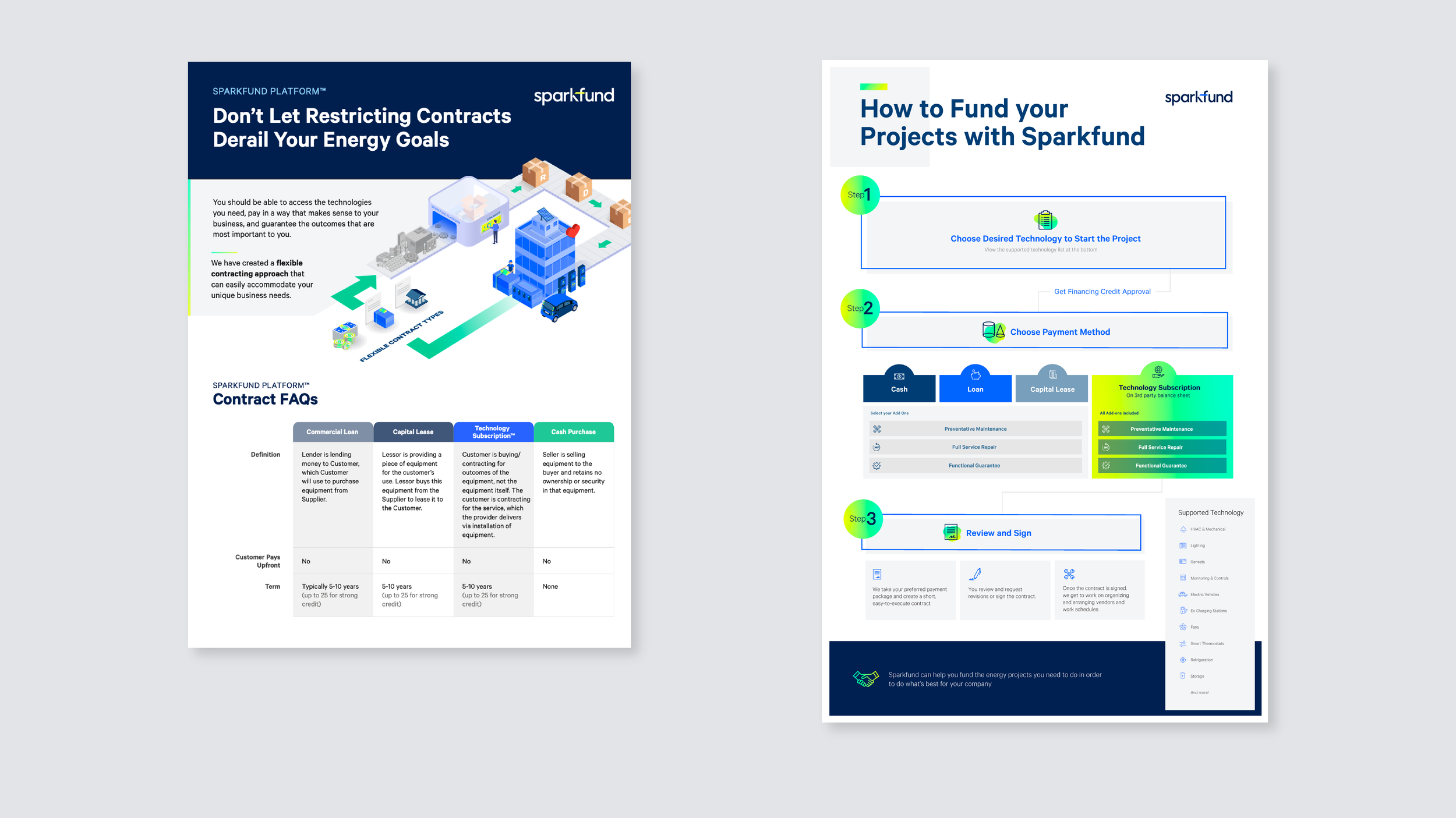
Sparkfund’s business has a lot of complex and convoluted processes and concepts. The new brand redesign aims to solve that problem by illustrating these complex and convoluted concepts in a simple, approachable, top-down design style.


Assets